Cleanse
Cloud Cleanser
gel · oat note · routine 01
E-commerce brand
A skincare e-commerce concept shaped through white vessels, soft light, and restrained visual space.
Studio concept, not client work

Case narrative
HUE is a self-initiated ecommerce concept about navigating an everyday skincare routine. It makes no real formulation or efficacy claims; the case explores how a growing range can help customers understand roles, compare options, and purchase with confidence.
Case narrative
Minimal white packaging feels coherent in a campaign image but can become indistinguishable in a product grid. The challenge was to create family resemblance and useful differentiation while preserving continuity from collection to product detail.
Case narrative
Ecommerce customers first narrow choice by category and routine step, then look for usage and fuller information. When naming, format, product cards, and detail modules follow the same order, shopping does not depend on long explanations.
Case narrative
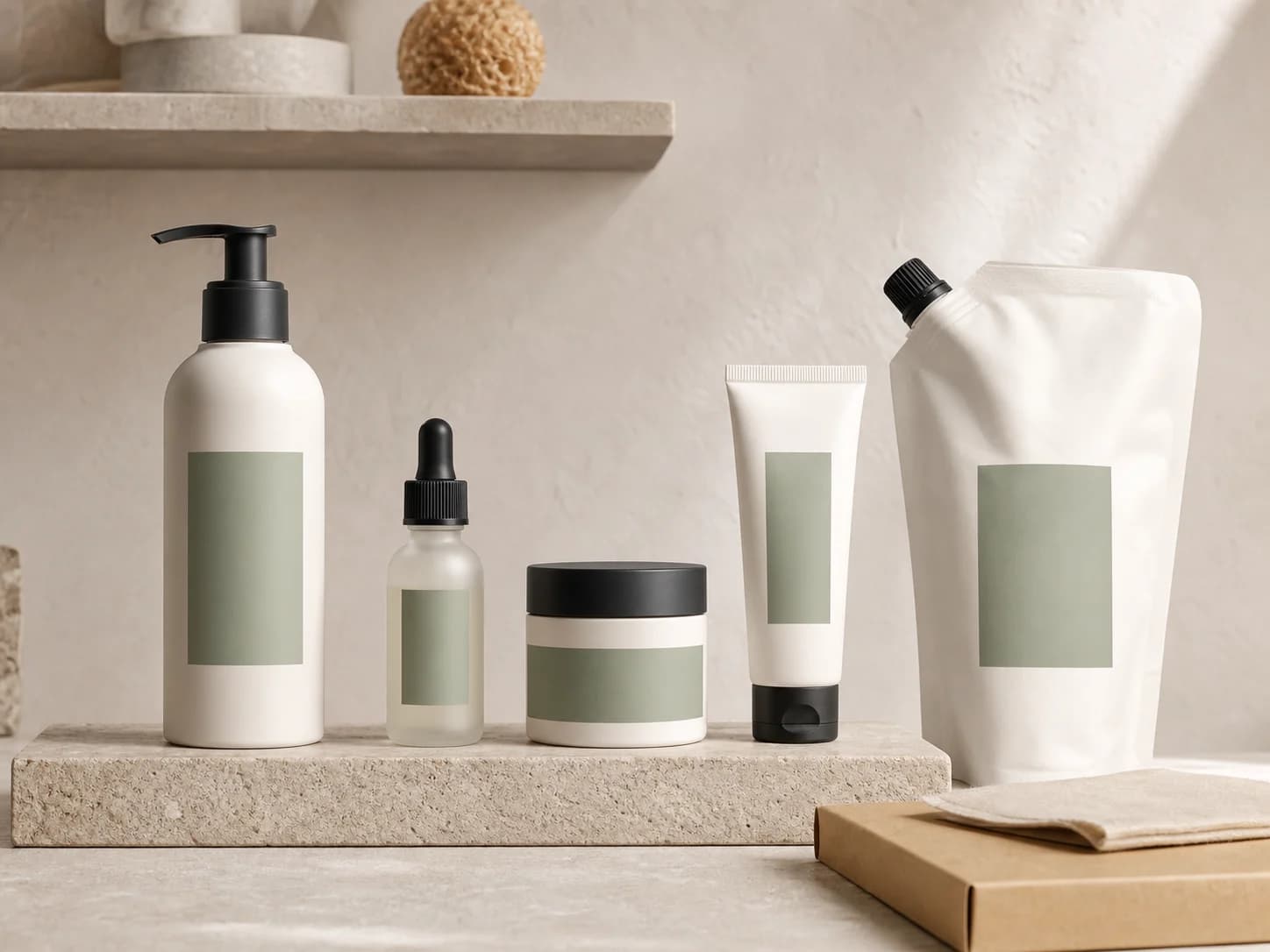
The SKU architecture follows routine steps. Container silhouette creates first-level distinction, sage fields unify the family, and consistent product cards, comparison cues, and detail order connect browsing to decision.
Case narrative
The result covers the product family, collection-to-detail journey, product-information modules, and content-production system. Each surface answers one question: grids support comparison, detail explains role and use, and imagery keeps one visual language across placements.
The systems below connect each strategic decision to an inspectable specification, touchpoint, or operable result.
Assortment system
Cleanser, serum, cream, tube, and refill use distinct silhouettes for their roles, while a consistent colour-field position preserves family recognition at product-card scale.
Commerce flow
The collection groups products by routine step and retains comparison cues. Product detail reuses the same names, colour fields, and role descriptions so context survives the transition.
Explore by step
Compare the range
Confirm a product
Product detail
The product-page opening explains role, routine step, and format choice before expanding usage, information fields, and pairings. It demonstrates hierarchy without claiming real ingredients or efficacy.
Daily serum
Recognise the product by routine step and format.
Content system
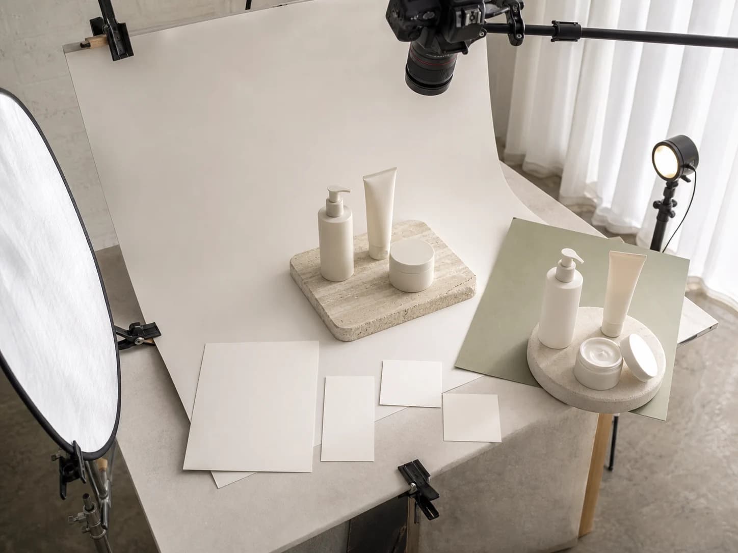
A consistent paper sweep, stone platform, soft light, and sage backdrop define the shoot. Hero, grid, and vertical social crops are planned together instead of restyling each channel.
Operable commerce prototype
Cleanse
gel · oat note · routine 01
Treatment
fluid · niacinamide note · routine 02
Moisturise
cream · ceramide note · routine 03
0 items
Delivery standards you can inspect
Concept demonstration — no order, inquiry, or reservation is transmitted.
Content completeness
The case connects background, challenge, insight, strategy, and design to each delivery decision.
Independent art direction
The visual system uses distinct colour, material, typographic rhythm, and information hierarchy.
Responsive delivery
Desktop, tablet, and phone reading preserve essential delivery information without horizontal overflow.
Keyboard access
Every link and applicable control is keyboard reachable with visible focus.
Truthful disclosure
This is a studio concept and does not claim a client commission, real transaction, or unverified commercial outcome.
Content completeness
Product architecture, filters, product specifications, cart, and completion state are individually inspectable.
Operable behaviour
The concept prototype is directly operable and exposes idle, loading, empty, error, and success states.
Related perspectives
Service · E-commerce
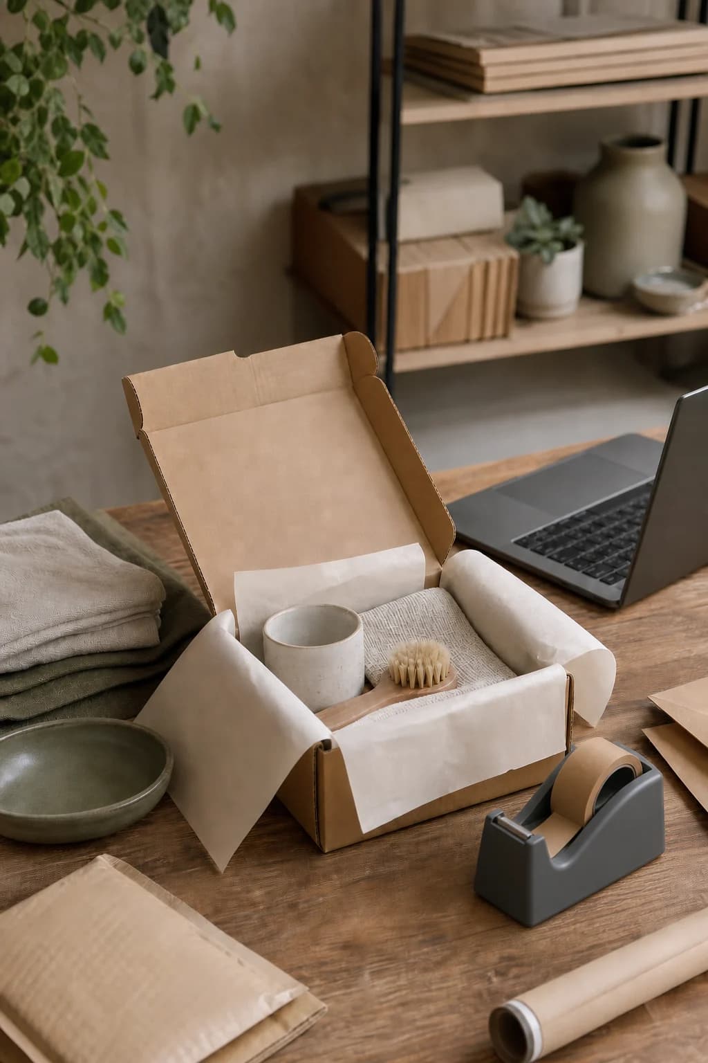
A platform-aware storefront and customer journey, with membership and logistics integrations scoped after feasibility is confirmed.
Service · Content & social
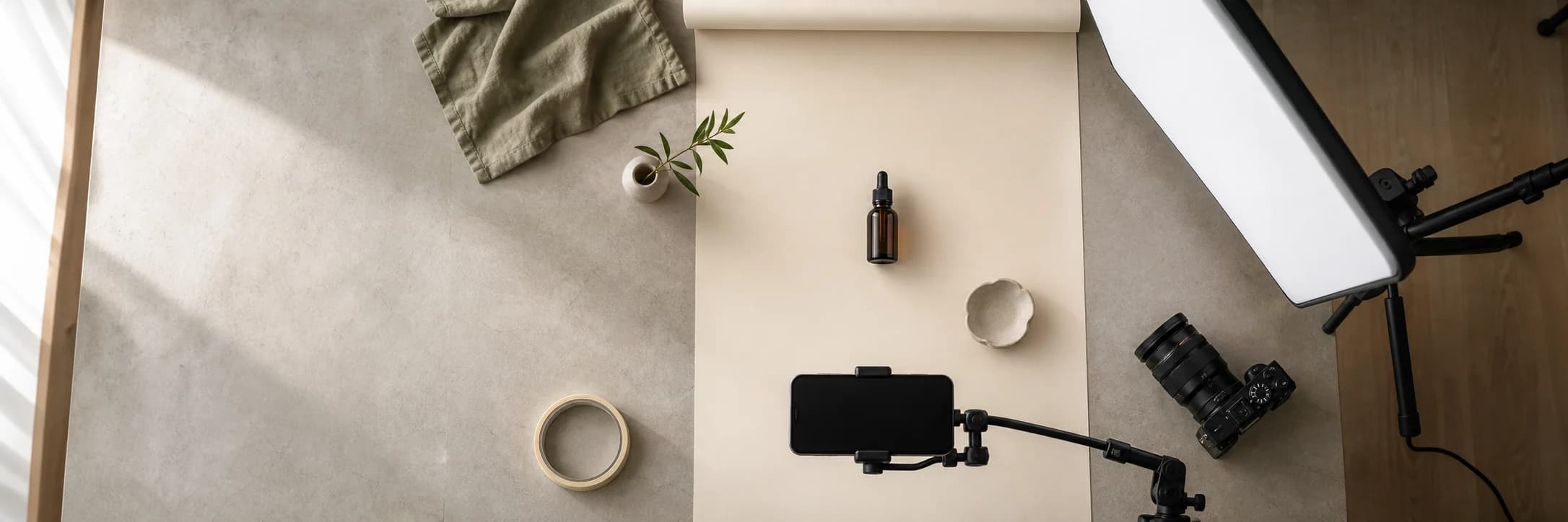
Social strategy, visual direction, and photography that make your brand easier to notice.
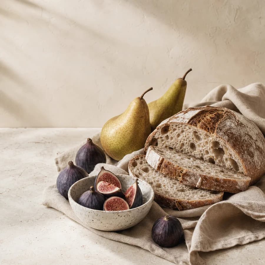
Project · E-commerce design
An editorial gourmet-commerce concept built from figs, bread, pears, ceramics, and tactile materials.
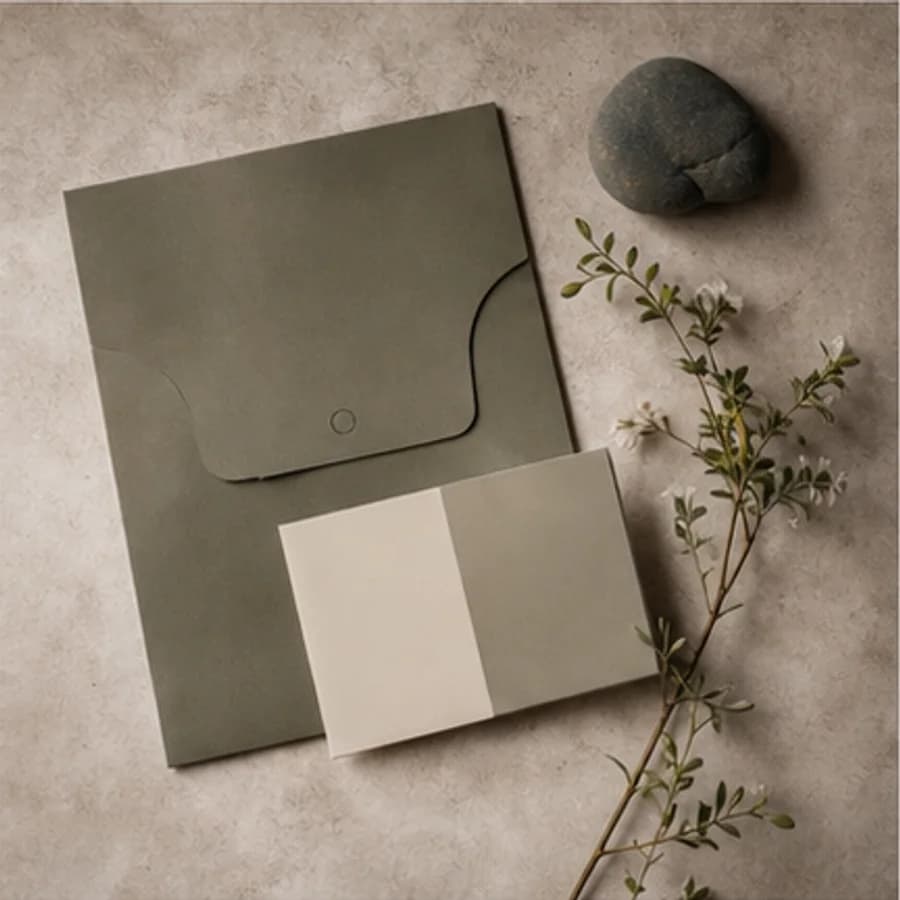
Project · Brand identity
A nature-led identity concept developed through olive paper, tactile samples, and botanical shadows.

Journal · Digital experience
When content structure and interface components share rules, each update does not start over.
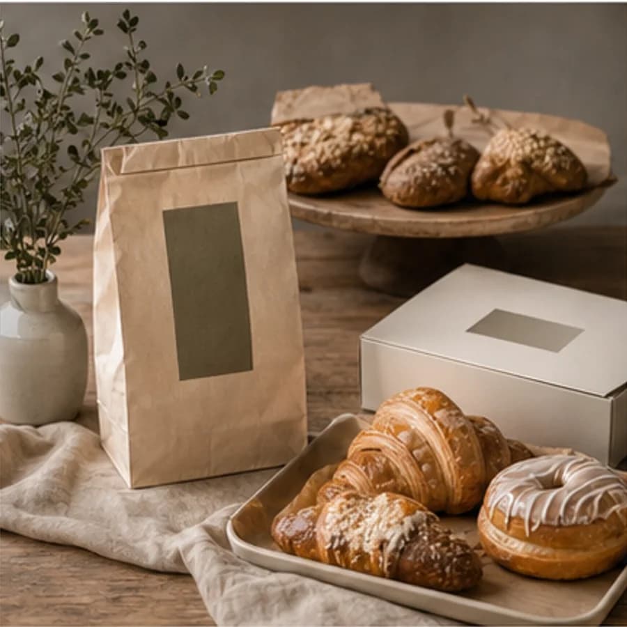
Project · Restaurant branding
A warm hospitality identity concept explored through bakery display, natural materials, and packaging.
Share