GH / 001
GREENHOUSE
Business card
Brand identity
A nature-led identity concept developed through olive paper, tactile samples, and botanical shadows.
Studio concept, not client work
Case narrative
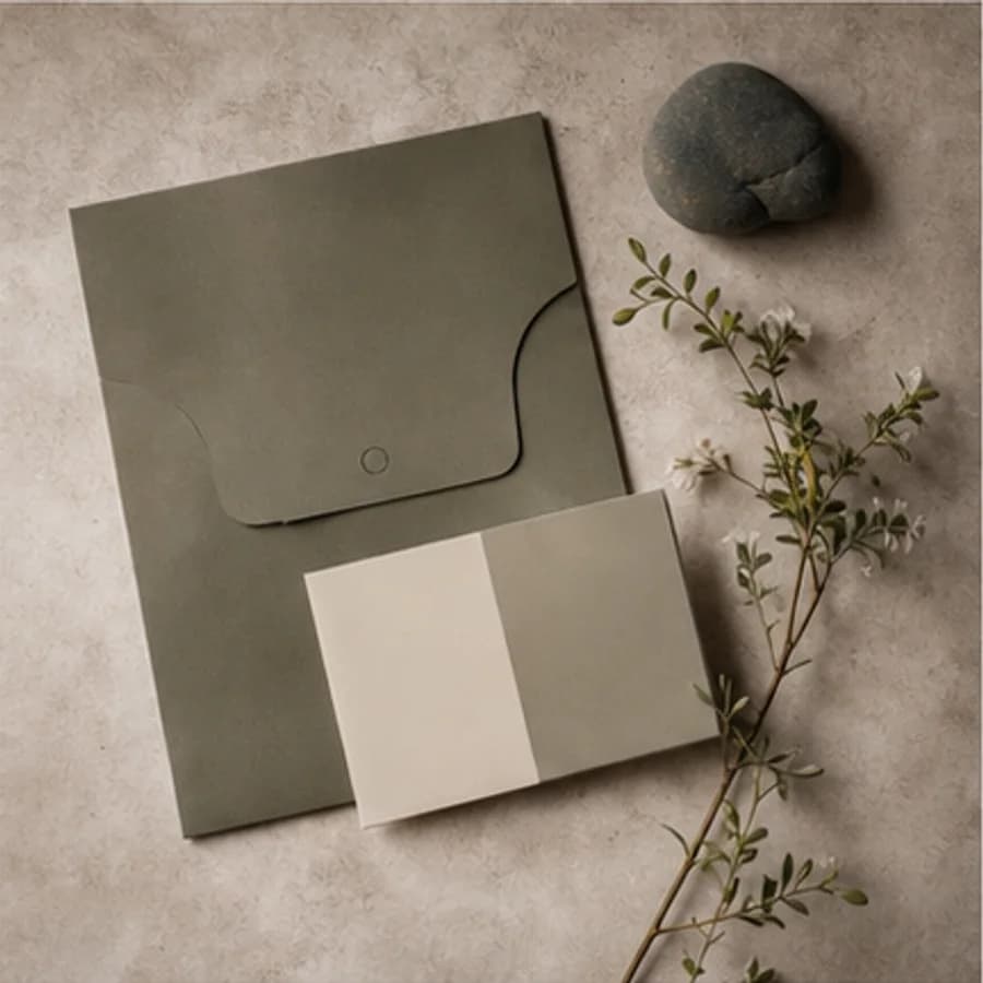
GREENHOUSE is a self-initiated identity concept about natural living, everyday objects, and long-term care. It begins with the existing olive and material-led cover, then develops a complete system for paper, object labels, and content communication.
Case narrative
A green swatch and botanical image can establish mood, but they do not explain how the brand is recognised, how information is ordered, how applications stay consistent, or whether content still works without plant photography.
Case narrative
A natural identity does not require a repeating leaf. Translating Observe, Tend, and Renew into frames, grids, and information rhythm gives materials, objects, and lifestyle content one quiet, ordered attitude.
Case narrative
The system uses an abstract greenhouse frame as its core mark, supported by Forest, Clay, Sand, and Mist; editorial serif and utility sans typography; a twelve-column grid; and detachable information labels. Rules come before applications.
Case narrative
The result includes the core identity and three brand values; colour, typography, and layout guidelines; business cards, care cards, and object labels; plus field-note, object-study, and practice-guide content templates. All names, objects, and applications are design examples, not real products, material specifications, or operating information.
The systems below connect each strategic decision to an inspectable specification, touchpoint, or operable result.
Identity system
The geometric mark avoids depicting a leaf. Shelter, division, and upward direction form the frame, supported by Observe, Tend, and Renew.
GREENHOUSE
Notice the marks left by material, use, and time
Use clear practices to extend objects and relationships
Let daily life create new possibility through cycles
Guideline system
Colour, type, and a twelve-column grid control hierarchy. Forest identifies, Clay accents, and Sand with Mist creates breathing room and information ground.
Observe slowly.
Tend with purpose / 02
12 columns · 3 / 5 / 4 information rhythm
Stationery system
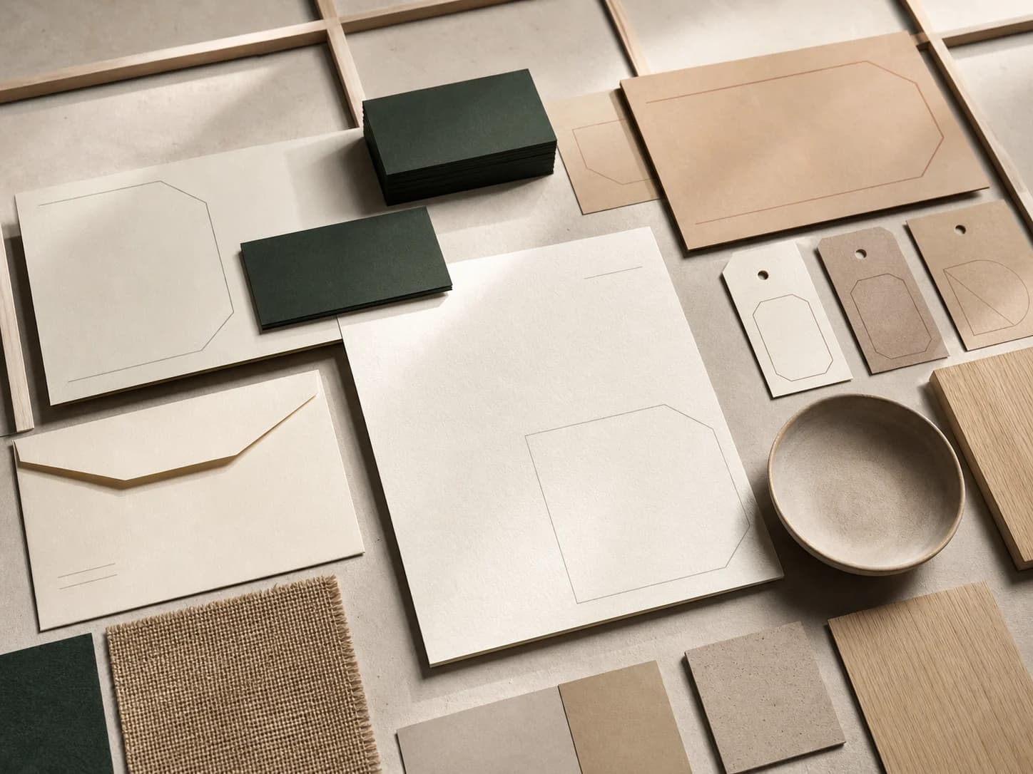
Business cards introduce the brand, care cards carry steps, and object labels classify. Each adapts the frame to its information density instead of copying one layout.
Business card
Content system
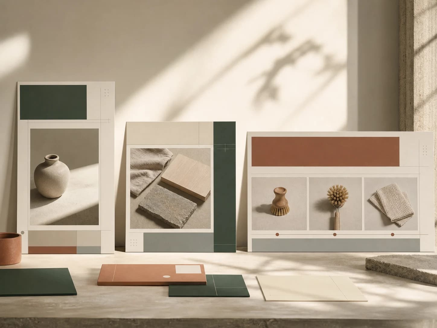
Vertical field notes record observations, square object studies examine materials, and horizontal practice guides explain steps while sharing palette, grid, and marks.
Delivery standards you can inspect
Content completeness
The case connects background, challenge, insight, strategy, and design to each delivery decision.
Independent art direction
The visual system uses distinct colour, material, typographic rhythm, and information hierarchy.
Responsive delivery
Desktop, tablet, and phone reading preserve essential delivery information without horizontal overflow.
Keyboard access
Every link and applicable control is keyboard reachable with visible focus.
Truthful disclosure
This is a studio concept and does not claim a client commission, real transaction, or unverified commercial outcome.
Content completeness
Positioning, logo rationale and variants, clearspace, misuse, colour, typography, grid, and applications are specified.
Related perspectives
Service · Brand identity
From logo to everyday applications, we build coherent identities with a point of view.
Service · Content & social
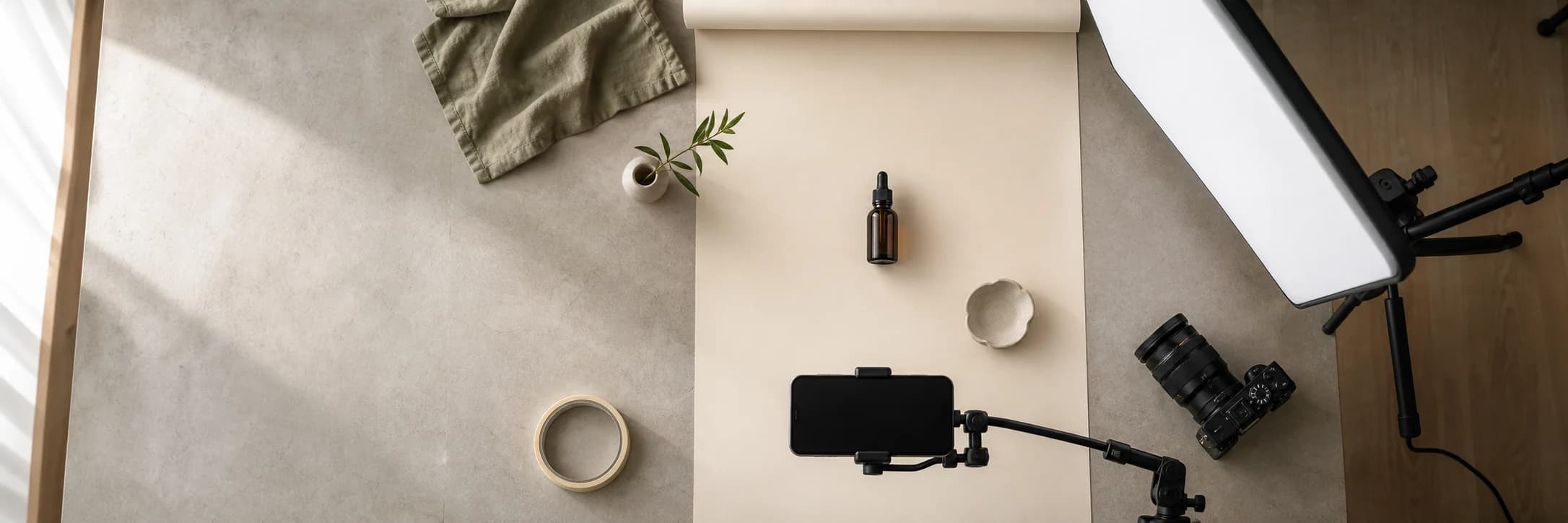
Social strategy, visual direction, and photography that make your brand easier to notice.
Project · Brand identity
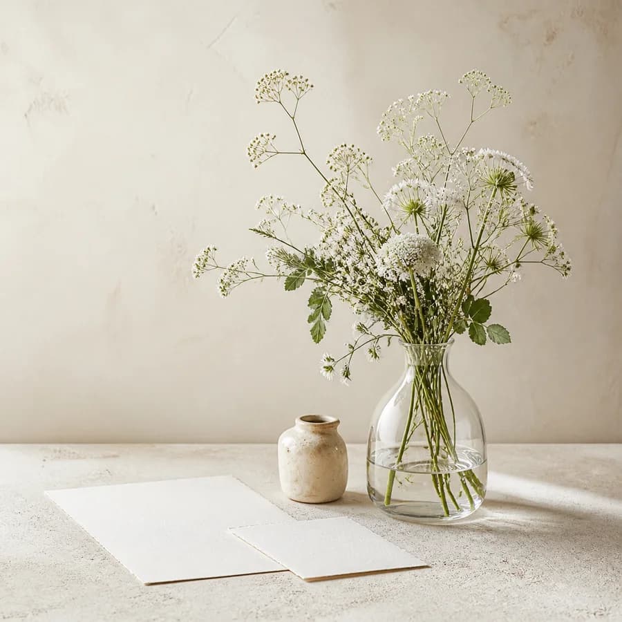
A quiet floral identity concept expressed through meadow flowers, clear glass, and blank stationery.

Project · E-commerce brand
A skincare e-commerce concept shaped through white vessels, soft light, and restrained visual space.
Project · Packaging design
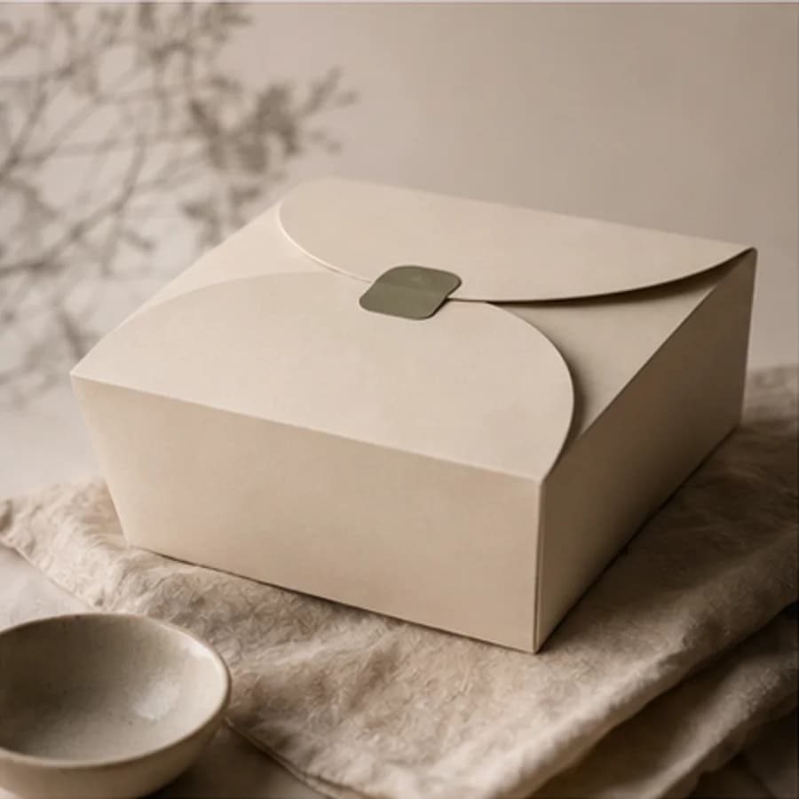
A daily-bakery packaging concept shaped through paper structure, soft materials, and restrained space.
Project · Restaurant branding
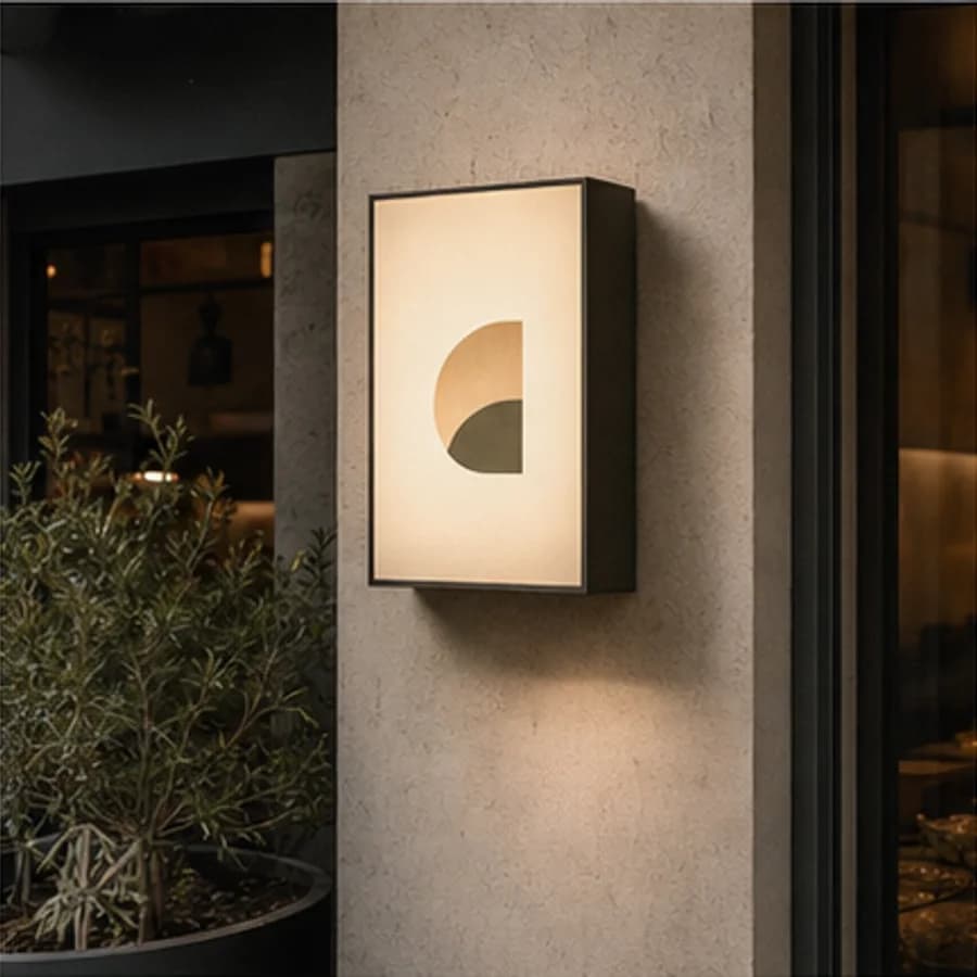
A neighbourhood restaurant concept shaped through a timber facade, warm light, and street presence.
Share