Dine inTonight · 01
Small plates
- 01.1NT$ —
- 01.2NT$ —
- 01.3NT$ —
Mains
- 02.1NT$ —
- 02.2NT$ —
- 02.3NT$ —
Drinks
- 03.1NT$ —
- 03.2NT$ —
- 03.3NT$ —
Restaurant branding
A neighbourhood restaurant concept shaped through a timber facade, warm light, and street presence.
Studio concept, not client work
Case narrative
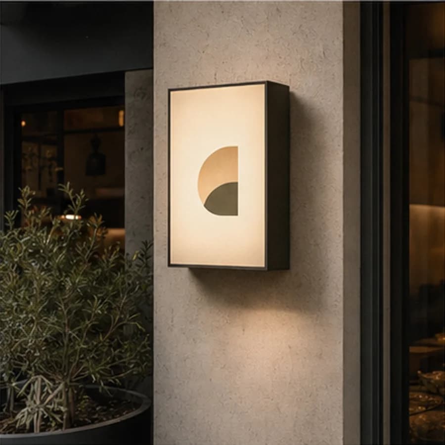
Alley Bistro is a self-initiated restaurant concept about evening neighbourhood dining, savoury food, and quick dine-in or takeaway service. Starting from its warm street sign, the case follows recognition, menu reading, ordering, pickup, and carrying the meal home.
Case narrative
A neighbourhood restaurant serves passers-by, dine-in guests, and preorder pickup at once. When the facade only creates mood while menu, queue, pickup, and online information operate separately, peak-time warmth turns into confusion.
Case narrative
At night, guests rely on a few strong signals: one light confirms the restaurant, one colour field marks entry, and one direction marker separates ordering from pickup. The voice should be direct, warm, and neighbourly rather than decorative.
Case narrative
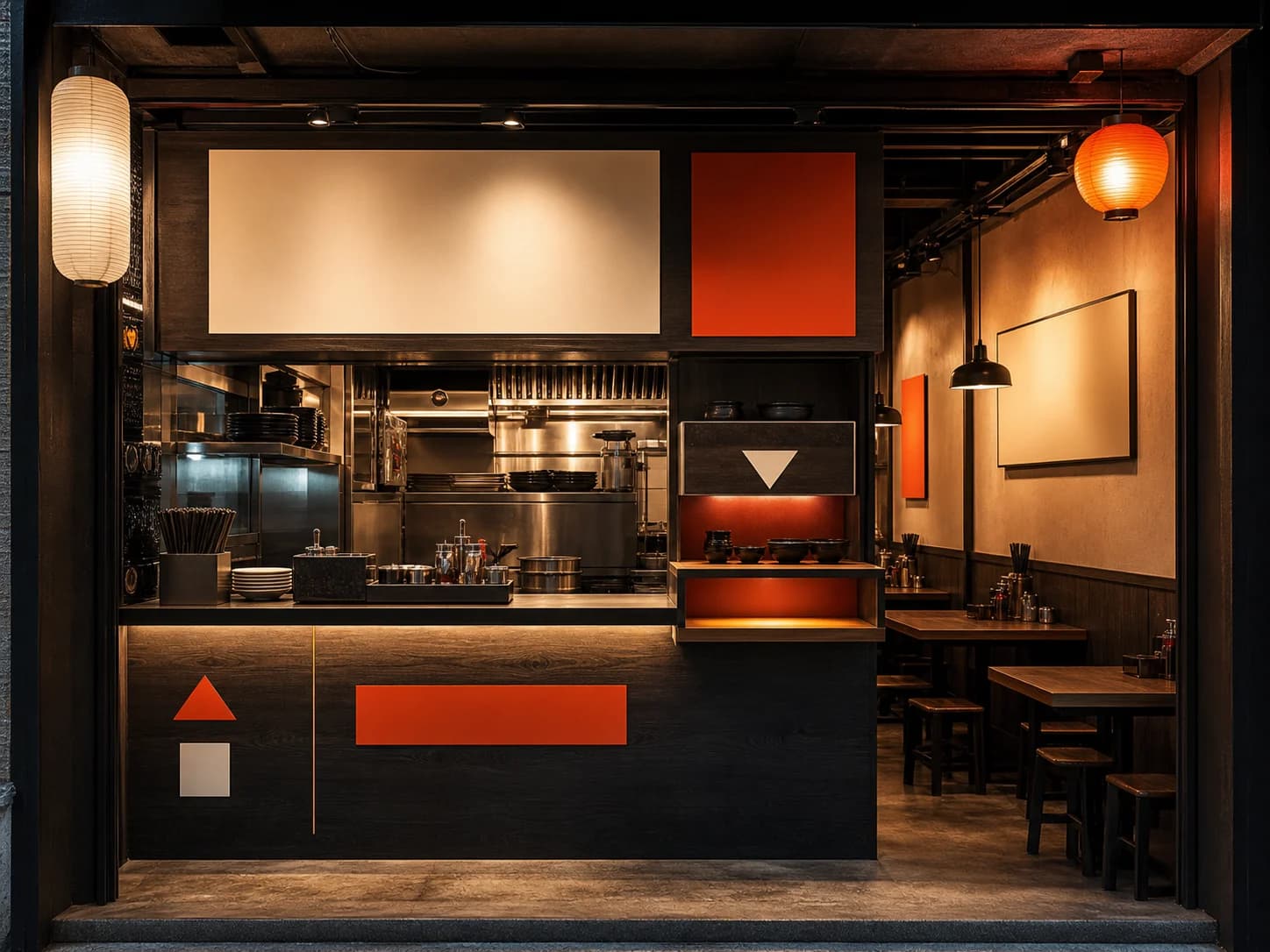
Charcoal timber, rice-paper white, lantern amber, and an ember triangle create recognition at street and hand scale. The same direction marker connects facade, menu categories, counter states, table cues, and online pickup information around choose, order, and collect.
Case narrative
The result includes a neighbourhood restaurant identity; night sign and facade; dine-in menu, ordering, and pickup hierarchy; savoury takeaway carriers and utensil touchpoints; and one direction system across street, counter, table, and online. All names, dishes, prices, spaces, and operating details are illustrative, not a real restaurant or service.
The systems below connect each strategic decision to an inspectable specification, touchpoint, or operable result.
Identity system
A sign frame and direction triangle replace a pictorial logo, supported by a straightforward, warm-after-dark, and neighbourly voice that stays clear at distance and close range.
ALLEY BISTRO
Alley Bistro
One light says welcome first
Less decoration, more useful action
As familiar as the corner nearby
Storefront system
Warm light attracts while ember markers direct. Entry, menu face, and pickup shelf create a left-to-right service rhythm that remains legible after dark.
Menu system
The dine-in menu separates small plates, mains, and drinks while keeping items and prices in one scan. Order and pickup cues sit at the reading endpoint instead of mixing with dishes.
Takeaway system
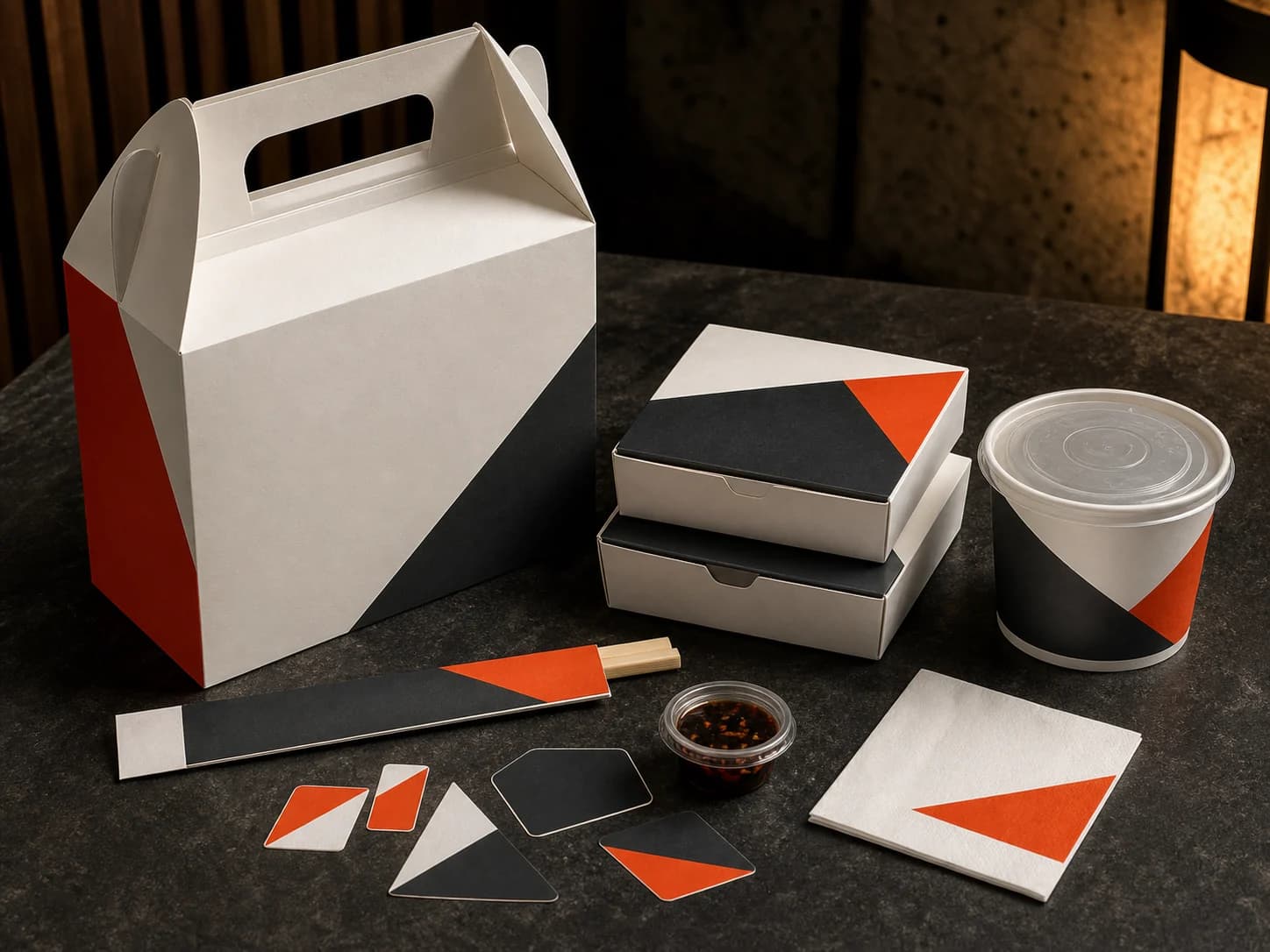
Handled carrier, low meal boxes, soup cup, chopstick sleeve, and handoff stickers form a functional family. Geometric fields create recognition without borrowing bakery packaging language.
Wayfinding system
Street signs, counter states, table cues, and online pickup information share the same triangle, number, and action verbs so guests do not relearn the system at each touchpoint.
See →
Order →
Confirm →
Collect →
Delivery standards you can inspect
Content completeness
The case connects background, challenge, insight, strategy, and design to each delivery decision.
Independent art direction
The visual system uses distinct colour, material, typographic rhythm, and information hierarchy.
Responsive delivery
Desktop, tablet, and phone reading preserve essential delivery information without horizontal overflow.
Keyboard access
Every link and applicable control is keyboard reachable with visible focus.
Truthful disclosure
This is a studio concept and does not claim a client commission, real transaction, or unverified commercial outcome.
Content completeness
Signage, night facade, spatial wayfinding, menu, table, takeaway, and cross-channel direction system are individually inspectable.
Related perspectives
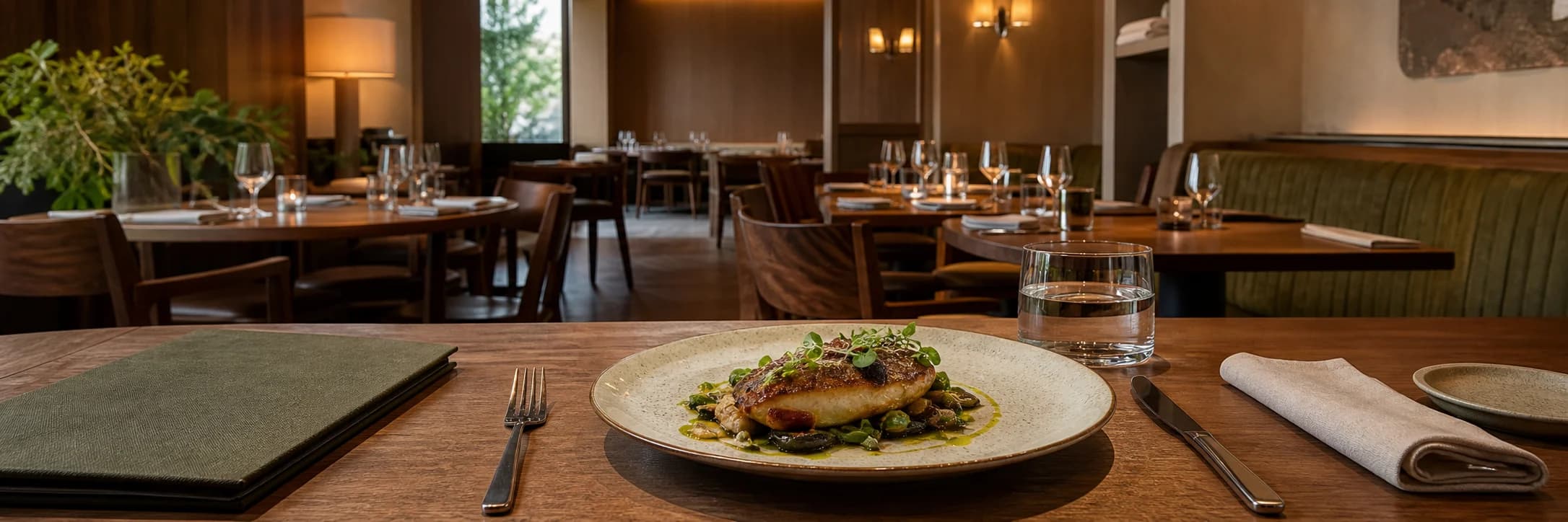
Service · Restaurant branding
Identity, menus, packaging, and spatial touchpoints shaped into one memorable experience.

Service · Brand identity
From logo to everyday applications, we build coherent identities with a point of view.
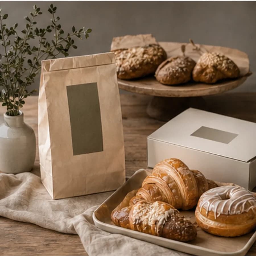
Project · Restaurant branding
A warm hospitality identity concept explored through bakery display, natural materials, and packaging.

Project · Brand website
A specialty-coffee website concept explored through handmade ceramics, beans, linen, and stone.

Project · Brand identity
A quiet floral identity concept expressed through meadow flowers, clear glass, and blank stationery.
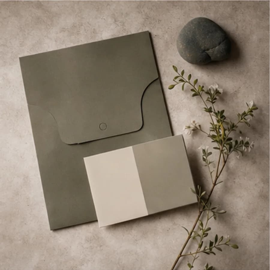
Project · Brand identity
A nature-led identity concept developed through olive paper, tactile samples, and botanical shadows.
Share