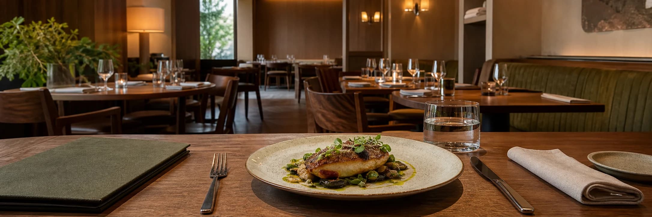
Service · Restaurant branding
Food & hospitality
Identity, menus, packaging, and spatial touchpoints shaped into one memorable experience.
Restaurant branding
A warm hospitality identity concept explored through bakery display, natural materials, and packaging.
Studio concept, not client work
Case narrative
Komugi Biyori is a self-initiated neighbourhood bakery-restaurant concept. The case follows the full journey from recognising the storefront and approaching the counter to reading the menu and leaving with an order.
Case narrative
A bakery photograph can express mood but not how a restaurant works. The challenge was to give signage, item categories, price reading, display, and takeaway handoff one coherent visual system.
Case narrative
Customers do not absorb a brand all at once. Trust is built through short decisions: finding the entrance, understanding the offer, knowing how to order, and recognising the package received at handoff.
Case narrative
Warm ivory, kraft paper, and muted olive establish recognition. A consistent system of rectangular colour fields, whitespace, and information hierarchy then links storefront, menu, counter cues, and packaging.
Case narrative
The result is an operating hospitality-brand prototype rather than a single mood image. Identity rules create consistency, the menu structures choice and price, the counter guides ordering and pickup, and the takeaway family carries recognition beyond the store.
The systems below connect each strategic decision to an inspectable specification, touchpoint, or operable result.
Identity system
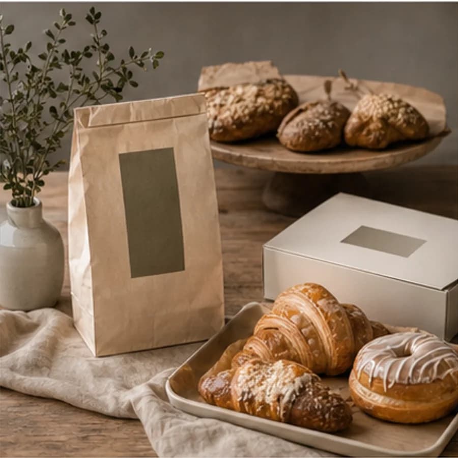
Material colour forms the base while olive blocks act as a recognisable signal at every scale. Spacious layouts keep the warmth restrained rather than decorative.
KOMUGI BIYORI
Menu system
The menu answers what kind of meal comes first, then lets guests compare items and prices in one scan. Ordering cues sit at the end of the reading path to reduce hesitation at the counter.
Baked breakfast
Illustrative concept prices
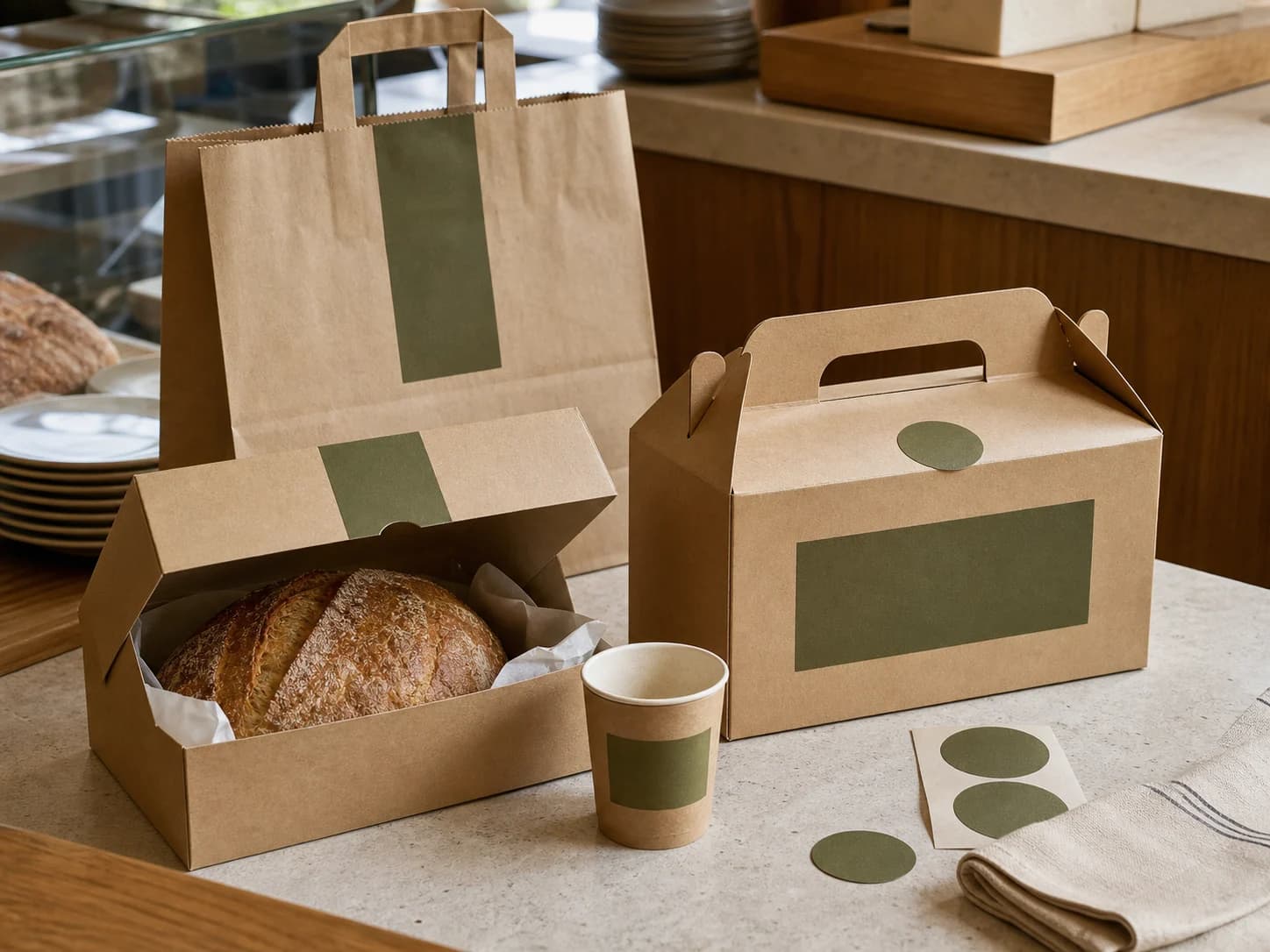
Takeaway system
Bags, bread boxes, handled meal boxes, and cup sleeves share one colour-block proportion. Round seals mark a completed handoff so every order size still belongs to the same brand.
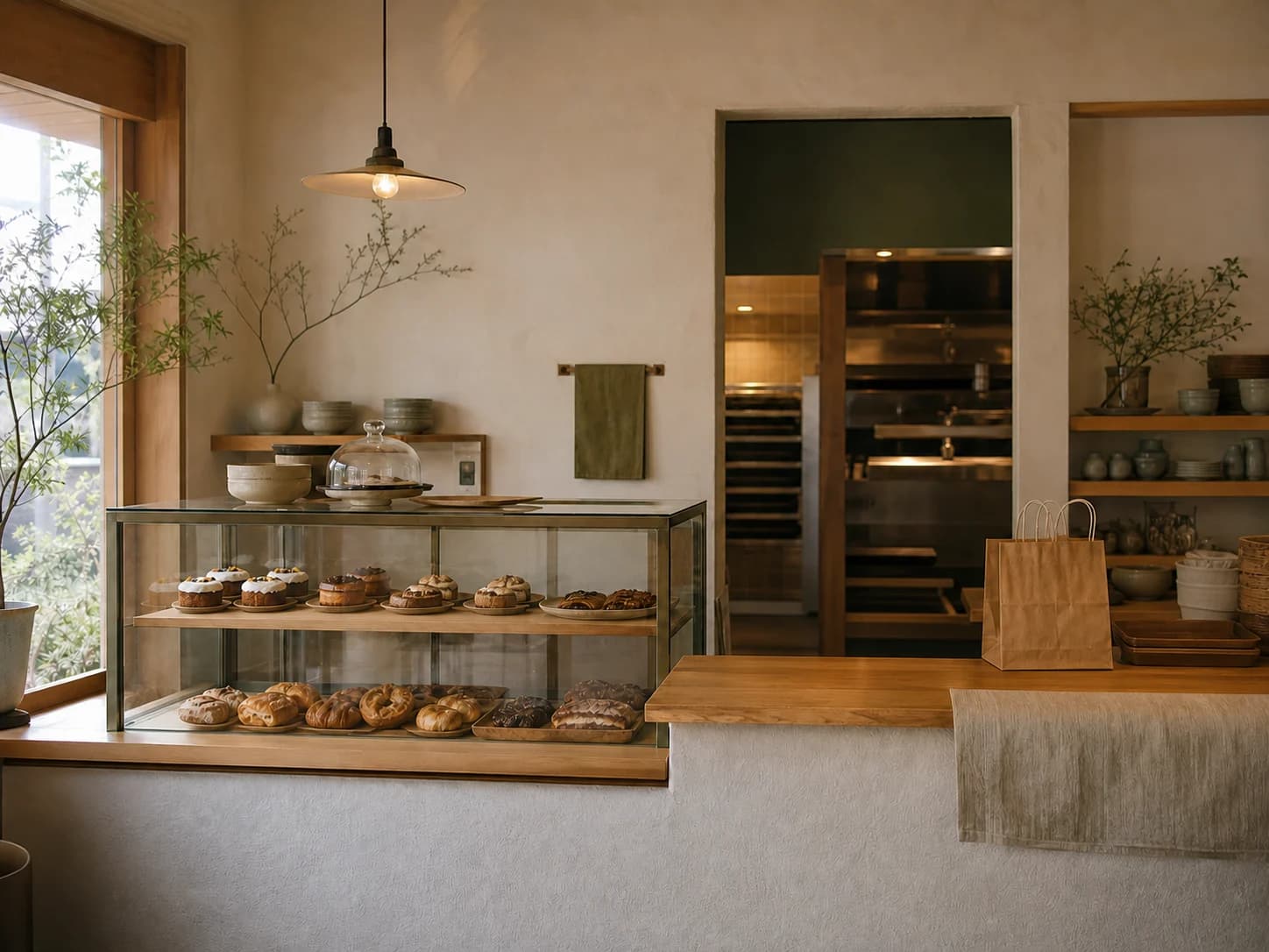
Storefront system
The display introduces the offer, the adjacent worktop supports payment and pickup, and the rear opening connects production. Materials and colour signal these roles without relying on excessive signage.
Delivery standards you can inspect
Content completeness
The case connects background, challenge, insight, strategy, and design to each delivery decision.
Independent art direction
The visual system uses distinct colour, material, typographic rhythm, and information hierarchy.
Responsive delivery
Desktop, tablet, and phone reading preserve essential delivery information without horizontal overflow.
Keyboard access
Every link and applicable control is keyboard reachable with visible focus.
Truthful disclosure
This is a studio concept and does not claim a client commission, real transaction, or unverified commercial outcome.
Content completeness
Identity, counter, menu, order and pickup flow, and takeaway packaging form one hospitality service system.
Related perspectives
Service · Restaurant branding
Identity, menus, packaging, and spatial touchpoints shaped into one memorable experience.

Service · Brand identity
From logo to everyday applications, we build coherent identities with a point of view.
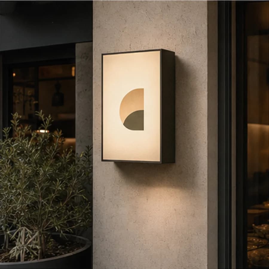
Project · Restaurant branding
A neighbourhood restaurant concept shaped through a timber facade, warm light, and street presence.
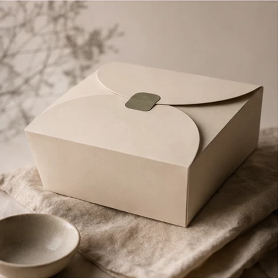
Project · Packaging design
A daily-bakery packaging concept shaped through paper structure, soft materials, and restrained space.
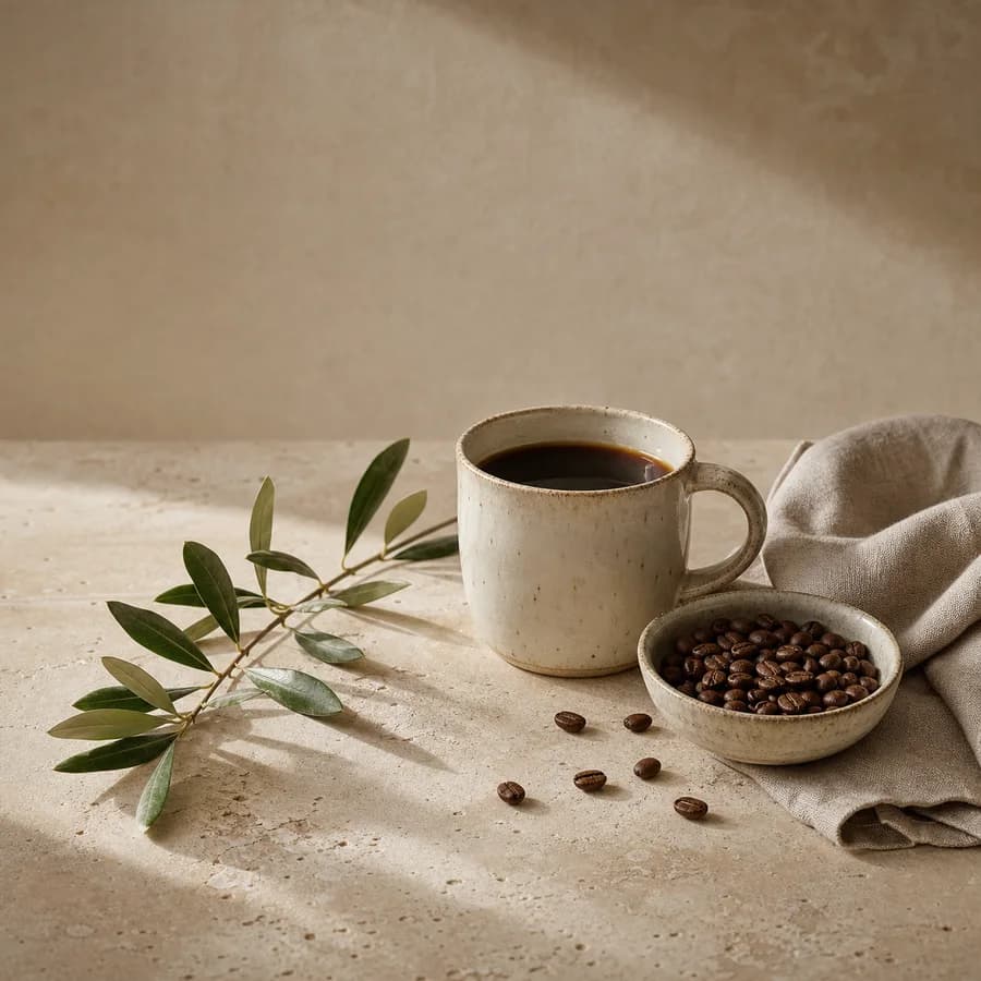
Project · Brand website
A specialty-coffee website concept explored through handmade ceramics, beans, linen, and stone.

Project · Brand identity
A quiet floral identity concept expressed through meadow flowers, clear glass, and blank stationery.
Share