Service · Brand identity
Identity systems
From logo to everyday applications, we build coherent identities with a point of view.
Packaging design
A daily-bakery packaging concept shaped through paper structure, soft materials, and restrained space.
Studio concept, not client work
Case narrative
SOFT BAKED DAILY is a self-initiated packaging concept for a daily bake. It expands one carton into boxes, bags, liners, labels, and counter display so a small changing range can remain coherent and easy to hand off.
Case narrative
Soft whitespace can set a mood but cannot solve size changes, grease protection, flavour recognition, or peak-time handoff. The system must explain what fits, how it closes, and how staff identify it without multiplying carton formats.
Case narrative
Daily variation lives mostly in contents and quantity, not in a need for new packaging every morning. Stable structures with changeable liners, seals, and SKU labels translate production changes into a readable front-of-house rule.
Case narrative
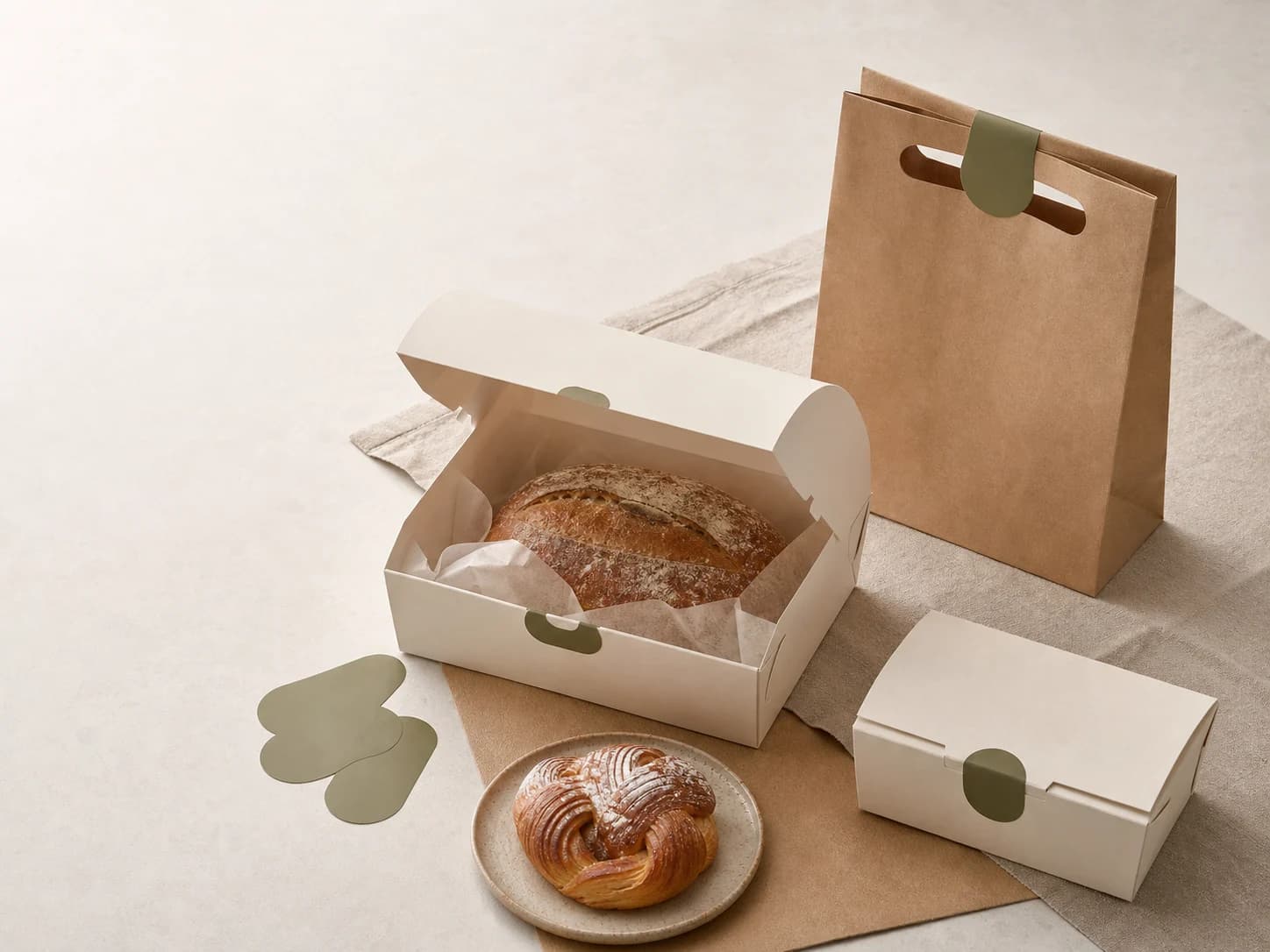
A single-item bag, small carton, and sharing box create the structural backbone. Warm-white stock, mist-grey type, and bake-tone labels stay consistent while item, flavour, size, and bake window follow one hierarchy; the seal doubles as a handoff check.
Case narrative
The result covers folding cartons and greaseproof liners, a box-bag-label family, flavour and size SKU logic, material and closure rules, and counter display for single purchases, bundles, and gifting. It is design evidence, not a claim about real recipes or manufacturing specifications.
The systems below connect each strategic decision to an inspectable specification, touchpoint, or operable result.
Packaging structure
The single bag, small carton, and sharing box share fold, closure, and liner logic, protecting different quantities with fewer structures.
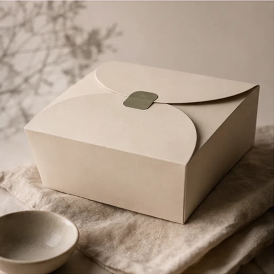
Curved-lid sharing box
SKU system
Item, flavour, size, and bake window keep one reading order across carton face, bag seal, and shelf edge.
Three capacities, one reading order
Flavour · Size · Baked 08:00
Flavour · Size · Baked 11:30
Item · Quantity · Pickup window
Material system
Outer carton, food-contact liner, carry bag, and seal use distinct paper roles, with separable parts and low ink coverage keeping disposal legible.
Assigned by contact and protection
Outer carton
Warm-white board
Structure and stacking
Food-contact liner
Greaseproof paper
Oil barrier
Carry bag
Unbleached kraft
Carry and separation
Seal positions
Print: 2 spot colours · water-based coating · no print on food-contact surfaces
Display system
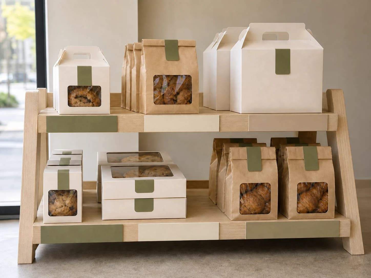
The shelf groups by format, then one label system connects singles, daily bundles, and sharing boxes so customers and staff use the same handoff cues.
Capacity first, then handoff occasion
Delivery standards you can inspect
Content completeness
The case connects background, challenge, insight, strategy, and design to each delivery decision.
Independent art direction
The visual system uses distinct colour, material, typographic rhythm, and information hierarchy.
Responsive delivery
Desktop, tablet, and phone reading preserve essential delivery information without horizontal overflow.
Keyboard access
Every link and applicable control is keyboard reachable with visible focus.
Truthful disclosure
This is a studio concept and does not claim a client commission, real transaction, or unverified commercial outcome.
Content completeness
Dieline, flat and finished dimensions, materials, print, SKU labels, display, and handoff rules have explicit specifications.
Related perspectives
Service · Brand identity
From logo to everyday applications, we build coherent identities with a point of view.
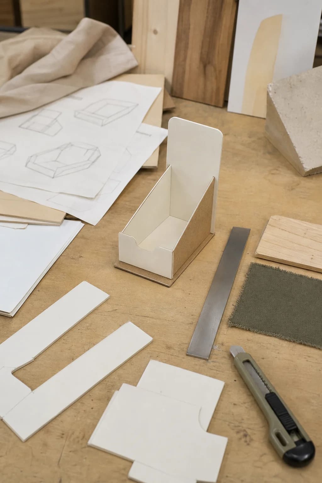
Service · Custom project
A focused creative and digital solution built around needs that do not fit a template.
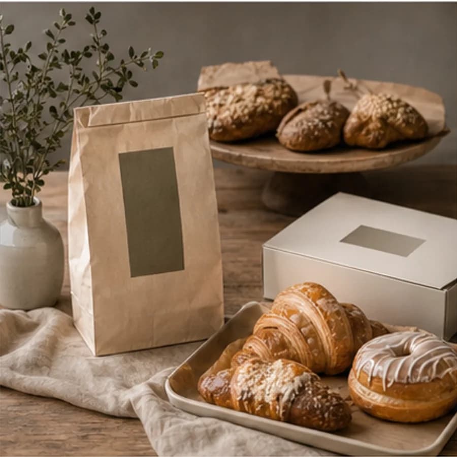
Project · Restaurant branding
A warm hospitality identity concept explored through bakery display, natural materials, and packaging.
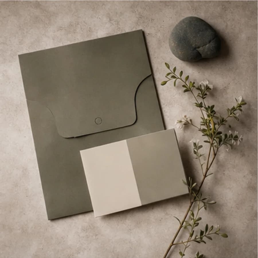
Project · Brand identity
A nature-led identity concept developed through olive paper, tactile samples, and botanical shadows.
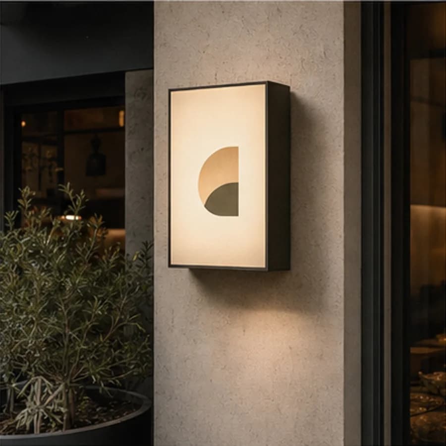
Project · Restaurant branding
A neighbourhood restaurant concept shaped through a timber facade, warm light, and street presence.
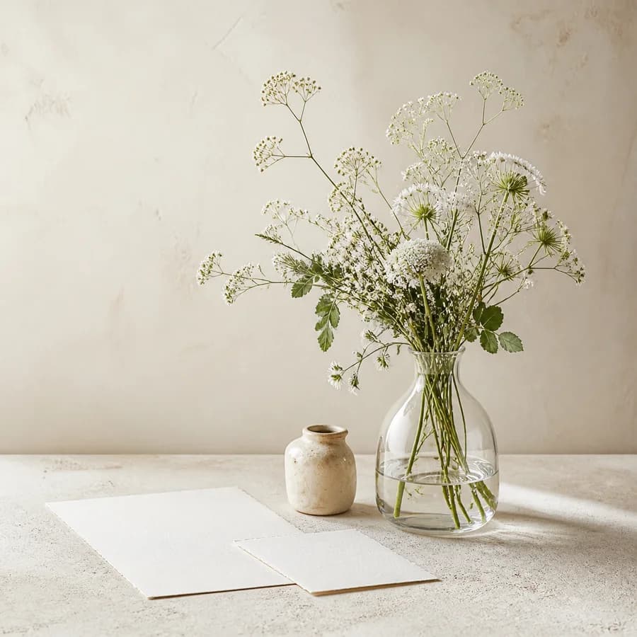
Project · Brand identity
A quiet floral identity concept expressed through meadow flowers, clear glass, and blank stationery.
Share