
Service · Brand identity
Identity systems
From logo to everyday applications, we build coherent identities with a point of view.
Brand identity
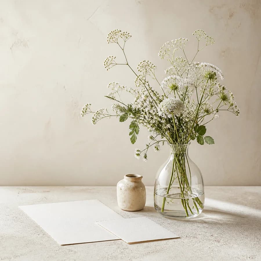
A quiet floral identity concept expressed through meadow flowers, clear glass, and blank stationery.
Studio concept, not client work
Case narrative
FLOWERDAZE is a self-initiated floral identity and website concept extending from service stationery and wrapping to portfolio browsing and inquiry.
Case narrative
A vase image can express taste but not service difference, process, or how to commission work. Physical touchpoints and the website need one legible system.
Case narrative
Clients often begin with occasion and atmosphere rather than flower names. Organising work by need before adding process and constraints leads to a clearer inquiry.
Case narrative
Fine olive rules, warm-grey square markers, and generous whitespace define the identity. The website carries that rhythm through occasion, work, method, and inquiry.
Case narrative
The result includes identity, service stationery, wrapping markers, site architecture, responsive portfolio UI, and an occasion-led inquiry flow grounded in studio process.
The systems below connect each strategic decision to an inspectable specification, touchpoint, or operable result.
Identity system
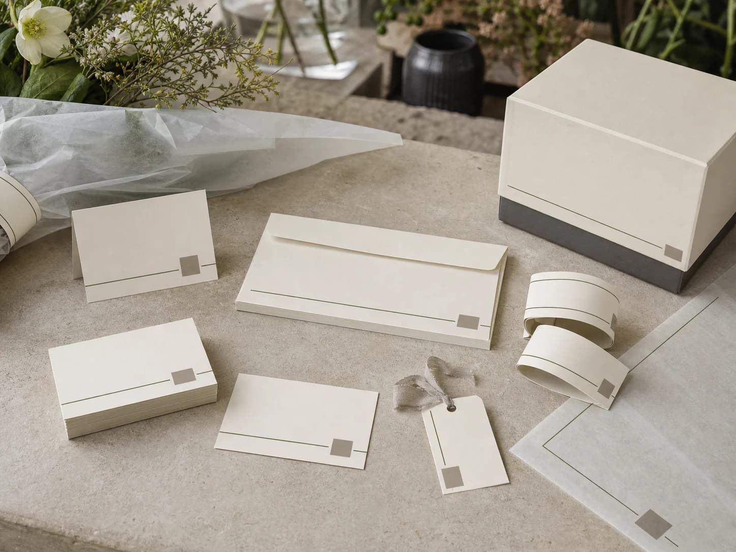
Fine rules, square markers, and whitespace provide order without competing decoration.
FLOWERDAZE
Stationery system
Cards, envelope, bands, tag, and flower box share one placement rule across information and packaging.
Information architecture
Gifting, space, and event needs open the site before work categories, method, and inquiry preparation.
Responsive interface
Desktop uses larger relationships while narrow screens become a clear single column; headings, captions, and actions keep their order.
Selected work
Selected work
Conversion flow
Inquiry unfolds through occasion, timing, space, and budget direction so clients can brief the studio without knowing flower names.
What are the flowers for?
Portfolio and inquiry prototype
Delivery standards you can inspect
Concept demonstration — no order, inquiry, or reservation is transmitted.
Content completeness
The case connects background, challenge, insight, strategy, and design to each delivery decision.
Independent art direction
The visual system uses distinct colour, material, typographic rhythm, and information hierarchy.
Responsive delivery
Desktop, tablet, and phone reading preserve essential delivery information without horizontal overflow.
Keyboard access
Every link and applicable control is keyboard reachable with visible focus.
Truthful disclosure
This is a studio concept and does not claim a client commission, real transaction, or unverified commercial outcome.
Content completeness
Identity, floral cards and packaging, portfolio browsing, responsive interface, and inquiry flow jointly support commissioning decisions.
Operable behaviour
The concept prototype is directly operable and exposes idle, loading, empty, error, and success states.
Related perspectives
Service · Brand identity
From logo to everyday applications, we build coherent identities with a point of view.

Service · Website design
A clear, distinctive website designed to strengthen your brand and user experience.
Project · Brand identity
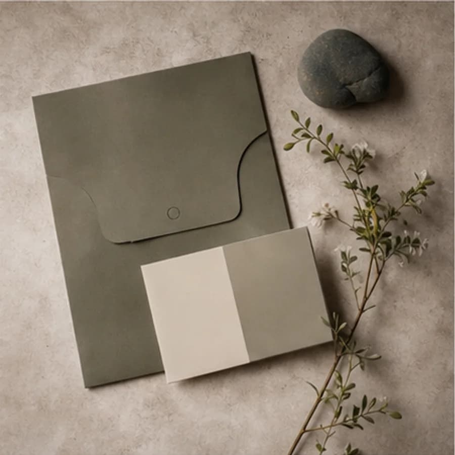
A nature-led identity concept developed through olive paper, tactile samples, and botanical shadows.
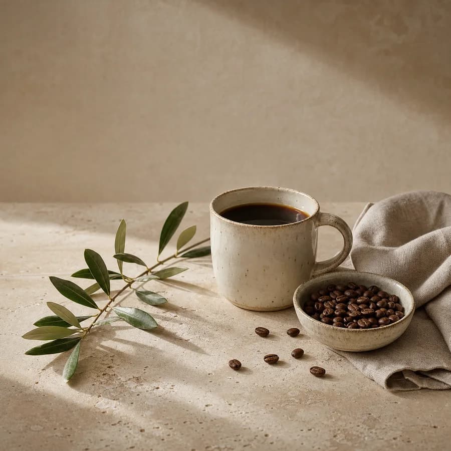
Project · Brand website
A specialty-coffee website concept explored through handmade ceramics, beans, linen, and stone.
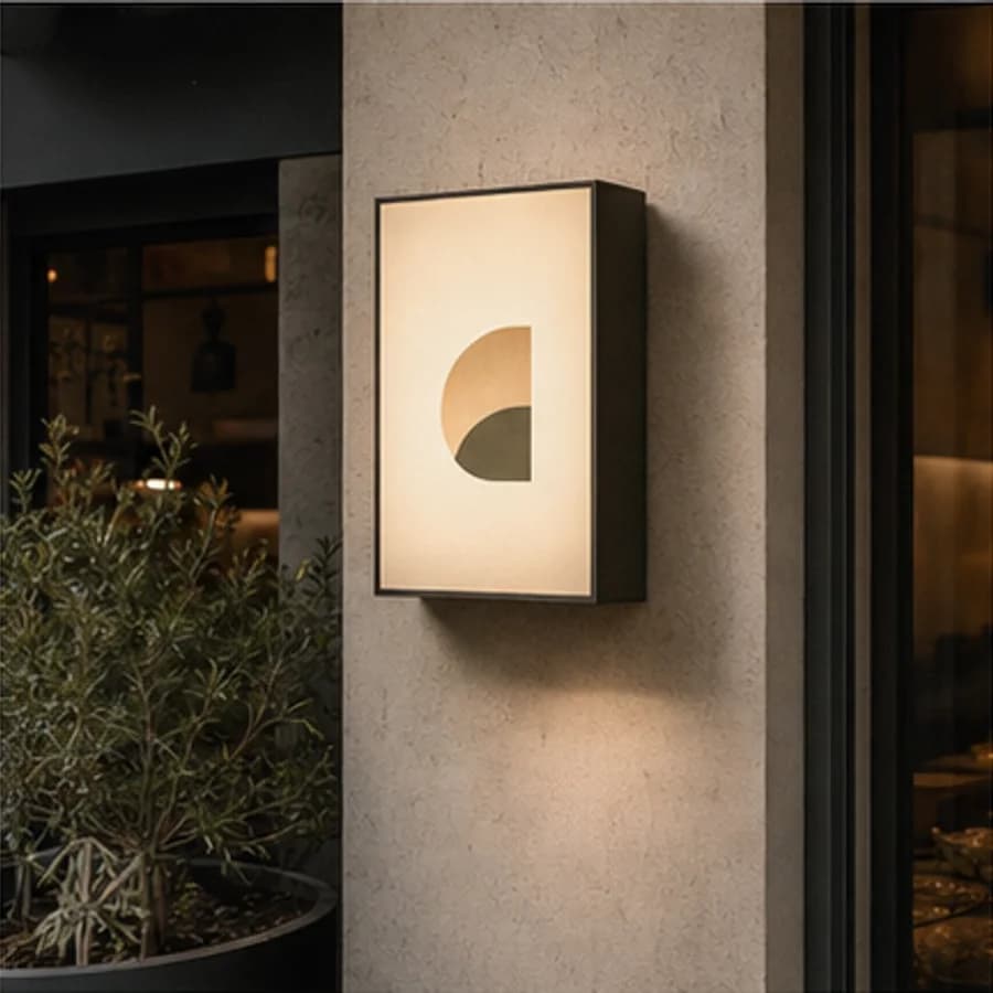
Project · Restaurant branding
A neighbourhood restaurant concept shaped through a timber facade, warm light, and street presence.
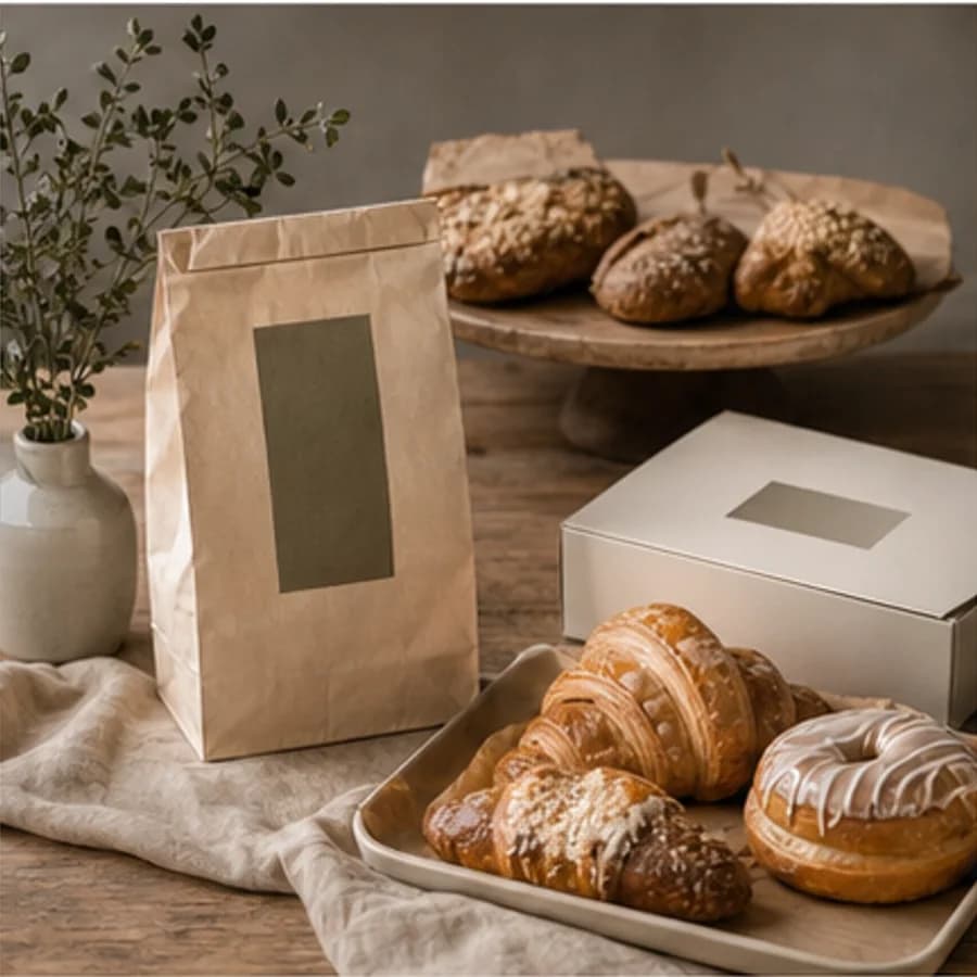
Project · Restaurant branding
A warm hospitality identity concept explored through bakery display, natural materials, and packaging.
Share