Coffee selection
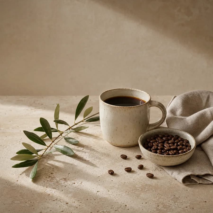
Bright cup
Crisp · fruit-led direction
Comfort cup
Round · roast-led direction
Brand website
A specialty-coffee website concept explored through handmade ceramics, beans, linen, and stone.
Studio concept, not client work
Case narrative
COFFEE STOPOVER is a self-initiated specialty-coffee website concept about a quiet urban pause. It expands one cup-led image into coffee selection, brew content, visit information, and a clear purchase path.
Case narrative
Specialty coffee sites can become mood galleries while visitors still cannot find what is available, how to choose, what the space offers, or whether to view the menu, buy beans, or visit. Content and action must become concrete without losing pace.
Case narrative
Visitors do not learn about coffee through one route: some begin with cup character, some with brewing, and others with the store. Making those intentions visible on the homepage creates a clearer path than burying everything inside one brand story.
Case narrative
The site organises navigation around what to drink, how to brew, and where to pause. Comparable coffee cards, editorial brew stories, and a visit page combining space, menu, and arrival actions keep one reading priority across devices.
Case narrative
The result includes a homepage, coffee menu, brew stories and visit sitemap; desktop, tablet and mobile core screens; coffee content and product modules; and buy-beans, view-menu and visit conversion paths. All coffees and store details are design examples, not real products, addresses, or operating information.
The systems below connect each strategic decision to an inspectable specification, touchpoint, or operable result.
Information architecture
The homepage separates coffee selection, brew stories, and visit needs before each path connects content to its primary action.
How would you like to pause?
Weekly selection · Brewing · Visit
Cup character · Brew guide · Choose
Tools · Steps · Observations
Space · Menu · Arrival
Responsive interface
Desktop keeps editorial space, tablet reduces columns, and mobile fixes content and action order instead of shrinking the desktop composition.
This week’s coffees
This week’s coffees
This week’s coffees
Conversion flow
Buying beans, viewing the menu, and visiting each receive a clear entry, required context, and completion state instead of sharing one generic button.
Choose → Item → Cart
Selection complete →Drinks → Price → Today
Ready to order →Space → Service → Directions
Plan the visit →Content system
Comparable coffee cards support selection, brew stories explain method, and visit modules clarify seating and service while sharing one visual language.
Bright cup
Crisp · fruit-led direction
Comfort cup
Round · roast-led direction
Tools, ratio, steps, and observation
Bar, seating, and visit preparation
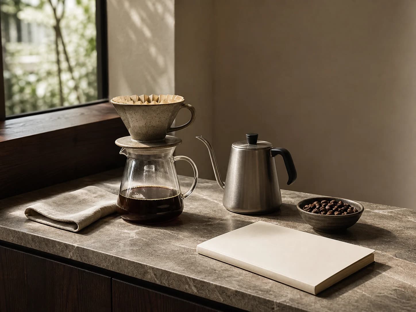
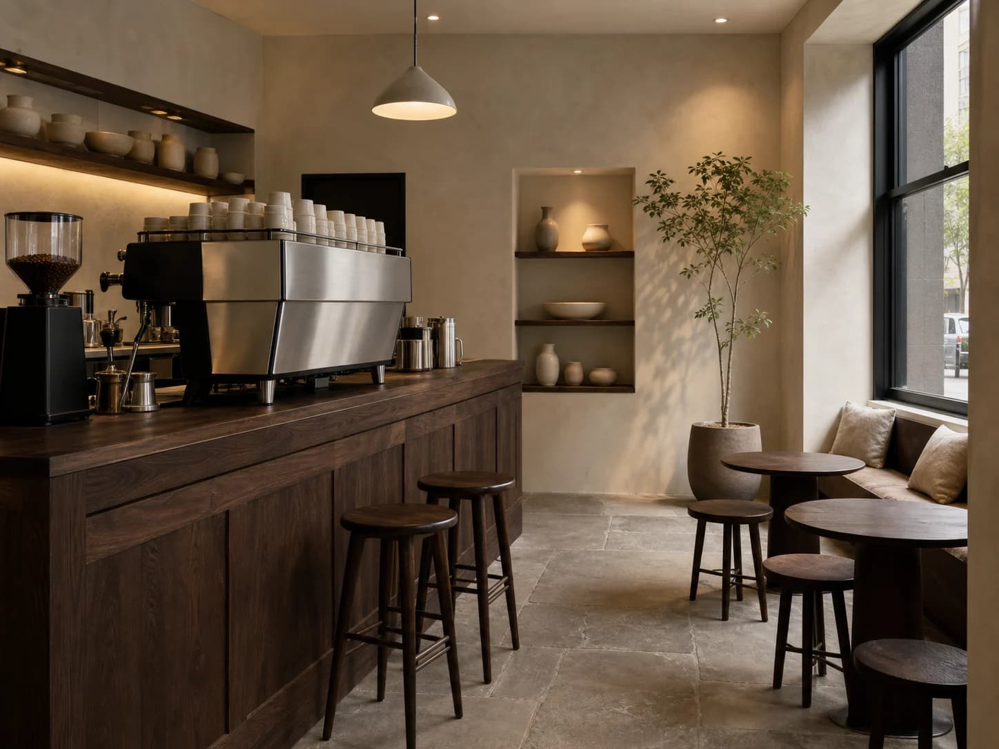
Coffee and visit prototype
Bean list
All store names, hours, seating, and availability are illustrative.
Delivery standards you can inspect
Concept demonstration — no order, inquiry, or reservation is transmitted.
Content completeness
The case connects background, challenge, insight, strategy, and design to each delivery decision.
Independent art direction
The visual system uses distinct colour, material, typographic rhythm, and information hierarchy.
Responsive delivery
Desktop, tablet, and phone reading preserve essential delivery information without horizontal overflow.
Keyboard access
Every link and applicable control is keyboard reachable with visible focus.
Truthful disclosure
This is a studio concept and does not claim a client commission, real transaction, or unverified commercial outcome.
Content completeness
Bean list, flavour filtering, brew content, store information, and visit confirmation are readable or operable.
Operable behaviour
The concept prototype is directly operable and exposes idle, loading, empty, error, and success states.
Related perspectives

Service · Website design
A clear, distinctive website designed to strengthen your brand and user experience.
Service · Restaurant branding
Identity, menus, packaging, and spatial touchpoints shaped into one memorable experience.

Project · Brand identity
A quiet floral identity concept expressed through meadow flowers, clear glass, and blank stationery.
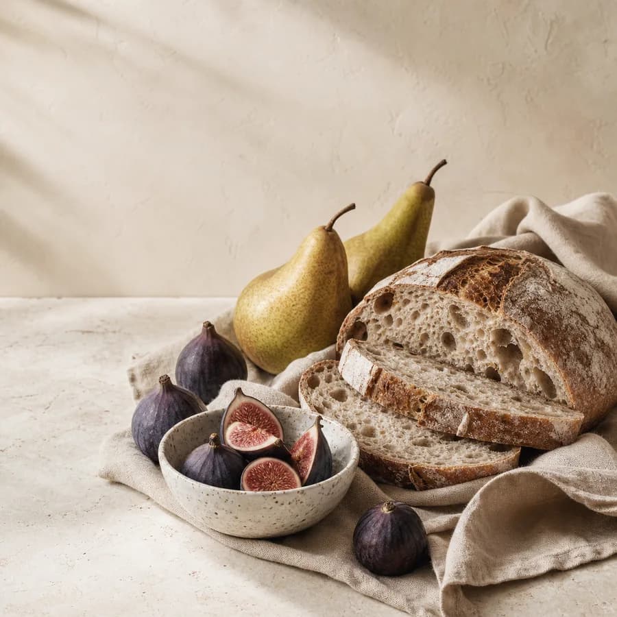
Project · E-commerce design
An editorial gourmet-commerce concept built from figs, bread, pears, ceramics, and tactile materials.
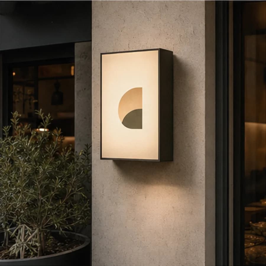
Project · Restaurant branding
A neighbourhood restaurant concept shaped through a timber facade, warm light, and street presence.
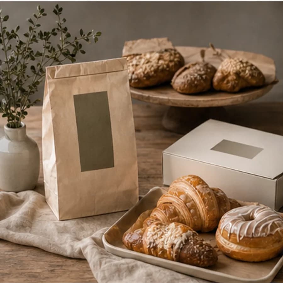
Project · Restaurant branding
A warm hospitality identity concept explored through bakery display, natural materials, and packaging.
Share